What are the best color combinations for website design
Choosing the right color combinations for a website is a very important part of website designing. If your color scheme doesn’t resonate with the niche of your website then your audience may not connect with your content that well. A right color combination, on the other hand, can greatly enhance the chances of your website doing well in your niche.
Here, in this article, we share with you some of the most used color combinations in the world of the web to lure the audience. You can take ideas from these listed color schemes, and choose one for your website. But before the list, let’s understand why colors are so important for your website.
Why is color scheme important for websites?
Most people think that it doesn’t matter how your website looks as long as you publish great content. While it’s true that nothing is more important for a website than quality content but in the age of UI and UX and agency for UX design, the looks of your website do matter a lot. Some other reasons why colors are important for a website are
- Colors impact Visitor’s Phycology
The first impression of your website on a new visitor is mainly focused on the color scheme of your website. According to a report, 90% of the first impression of a visitor on a website is based on the color scheme of that website.
Apart from that, buying decisions are also color based so it’s important that you pick a color that persuades your visitor to buy from you. Thus, choosing the right color combination can convert your visitors into your customers.
- Color increases brand recognition
According to many webmasters out there, colors increase brand recognition by 80% i.e your website color scheme becomes synonymous with your brand’s identity.
- Color increases engagement
The attention span of people is lesser now when compared to a decade back, hence marketers are doing everything to increase the user engagement on their website. They use images, videos, and infographics to get the attention of their audience. The color scheme also plays a major role in the engagement of a website.
Best Color Combinations for Website design
- Simple and Clean

If you want to keep your website color scheme to minimalist then you can go with a simple and clean color scheme. The websites that have a simple and clean look mainly use a monochromatic color scheme i.e a single color throughout the website with a hint of secondary color. Using less color on your website makes it look clean and sober.
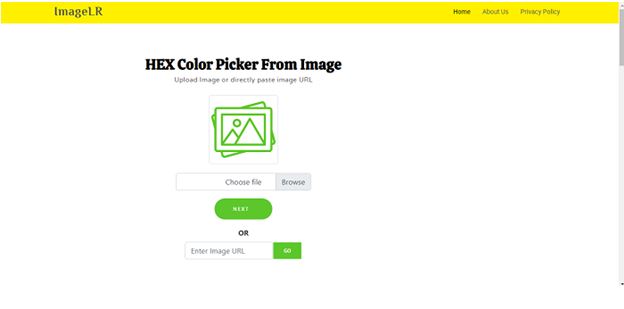
Pro Tip: You can use the color picker from image tool to get the color code from any of the images listed here or other external images.
- Earthly and Pastel

Earthy colors, or in other words all colors that can be found in nature, are among the most popular colors chosen for website color schemes. Like color Green, Brown, Blue, Yellow, and Orange. Using such a combination of colors will make your website look more trustworthy since people tend to trust natural products a lot.
- Cheerful and sleek
If you’re targeting a younger audience then the cheerful and welcoming color scheme will be the right choice for you. You can use a combination of vibrant and cool colors to balance out each other and give your website a cheerful yet sleek look.
- Bright and Elegant
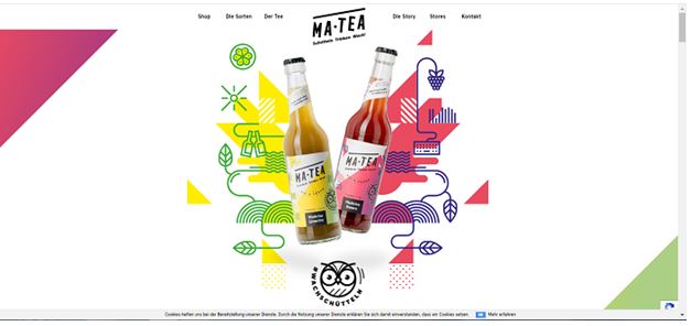
The bright and elegant color scheme gives your website a rich look, it has a combination of light colors and a shade of darker colors. Such websites work well in catching the attention of the audience.
- Morden and Professional

Using a professional color scheme can make your website look boring, but not when you mix it with a hint of modern colors. You can use this color scheme on your website if you want to make your website look professional as well as cool.
- Dark and Dramatic

Dark color schemes are easily associated with luxury and mystery, moreover, the dark website color schemes feel intriguing. Thus, such colors certainly provoke curiosity in the minds of your visitors and can easily attract their attention. You can go with a fully dark theme or you can combine it with one bright color to jazz up the screen,
- Soft and pale
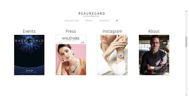
Soft and pale website color schemes are easy on the eyes and feel welcoming and cozy. This makes them perfectly good colors for a website of a brand that needs to communicate reliability and comfort.
Conclusion
So these were some of the best color combinations that you can try on your website, for more such color scheme ideas you can read this blog. Keep it simple and use fewer colors, because adding too many colors in your color scheme may confuse your audience. This may cause a bad experience for your visitors on your website and they may leave your website immediately.
